Remember the Phillips Curve? That old chestnut claiming an inverse dance between inflation and unemployment, like they’re caught in this endless see-saw game? If inflation climbs, unemployment falls—and vice versa. Sounds simple enough, right? But things… don’t always play out that nice, neat way, especially in 2024 and 2025.

The classic Phillips idea was cooked up decades ago, but anyone paying attention knows it got trampled back in the ’70s when stagflation showed up like an uninvited guest—high unemployment and rising prices, all at once. So economists began eye-rolling that supposed trade-off, whispered about something called the NAIRU (natural rate of unemployment), and scrambled to reinterpret the curve as a short-run thing that could shift or even vanish with expectations changing. Fast forward to today, and if you think the Phillips Curve is just resting in peace, think again.
2024-2025 is proving to be… let’s say, a puzzle wrapper on this puzzle. The labor market isn’t behaving like your standard textbook model. Yes, unemployment rates crept up slightly—from around 3.7% in mid-2023 to about 4.2% by summer 2024, according to recent records. Meanwhile, inflation didn’t just stay stubbornly high—it slid almost two percentage points during the same stretch, settling near that Fed target of 2-3%. Weird? Kinda. Because traditionally, a rise in unemployment should cool inflation, no? Here, a modest looseness in labor markets saw inflation fall quite a bit, supporting that idea of a “soft landing” where prices ease without a job massacre.
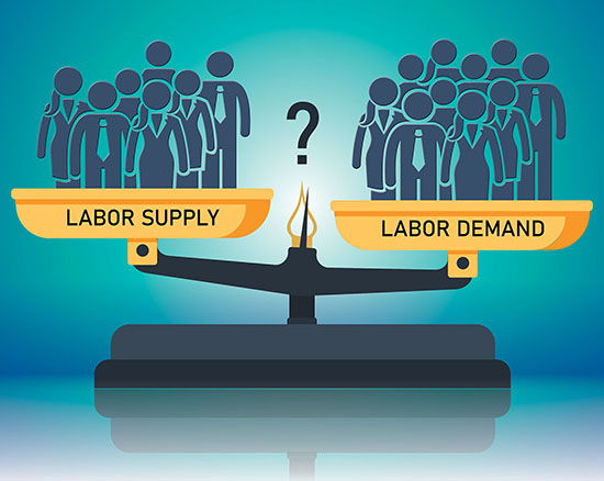
But here’s the kicker—the relationship isn’t perfectly linear or tidy. New evidence suggests this dynamic behaves like a nonlinear Phillips curve, where the slack in the labor market (how many job vacancies versus unemployed folks) matters a ton. The ratio of unemployed to vacancies climbed from about 0.66 to 0.88 in those 15 months, signaling some easing of the labor crunch but still a tight market overall. And guess what? Inflation reacted by softening accordingly, tracking closely along this curved path laid out by economists recently. So the curve hasn’t collapsed—it’s just gotten weirder, less predictable.
The labor market’s tightness—think job openings versus job seekers—is a massive factor here. Wage growth did puff up after the pandemic, especially in lower-paying roles, but as central banks tightened monetary screws, wage increases tempered. Yet, wages have stayed elevated compared to pre-pandemic times. So yeah, it’s a grind within a grind—the wage pressure supports inflation to some degree, but it’s not a runaway train anymore.
Supply shocks still leave their greasy fingerprints, too. Disruptions in supply chains and import prices nudged inflation up in 2021-22, even if underlying inflation avoided bursting through the roof. By 2023, inflation started its slow fade without a hammer drop on jobs, which is an unusual script compared to past recessions.
If you ask me, this all screams adjustment: the Phillips Curve isn’t dead but doesn’t want to be boxed in either. It’s more like a shape-shifting critter adapting to new labor market realities—and those realities are messy, colored by pandemic aftermaths, geopolitical messes, and tech shifts rearranging employment landscapes.
So is this just a random blip? Or a sign that the Phillips Curve will keep mutating as economies bounce back, falter, and re-bounce? Honestly, no one has a crystal ball. But the takeaway? Economic policy gets tricky here—trade-offs aren’t clear-cut, and forecasting inflation from unemployment alone is, let’s say, unreliable if taken too literally.
In the end, this relationship keeps its secrets close. It’s a riddle wrapped in data points, squeezed between stubborn inflation and job market quirks. And for those tracking the dance between prices and people’s livelihoods—it’s a reminder that the economy rarely sticks to the script we expect.
Maybe that’s why, despite all the charts and models, the labor market and inflation keep us guessing—always.


